My Academic Portfolio 🎓
This page showcases maps I have created through coursework in my master’s program.
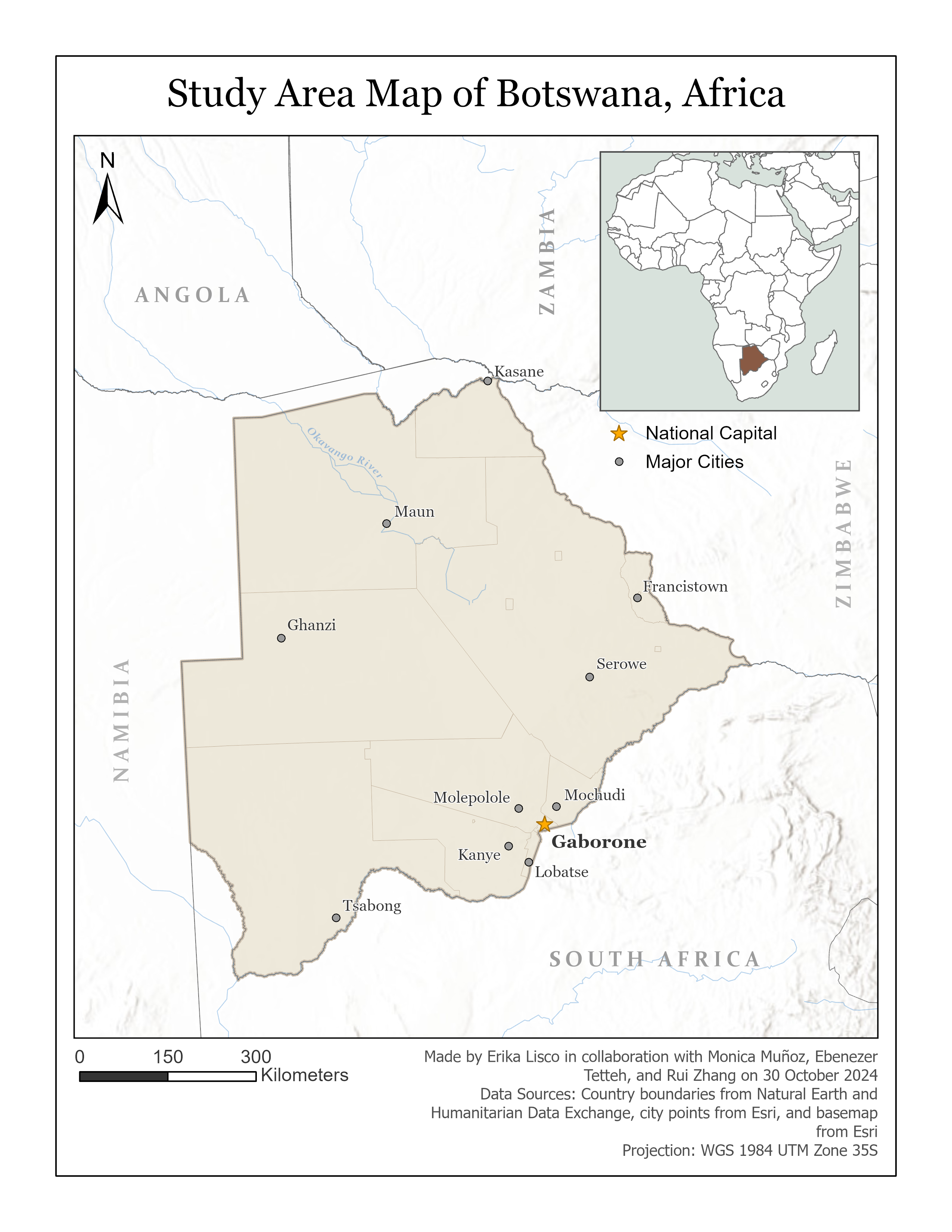
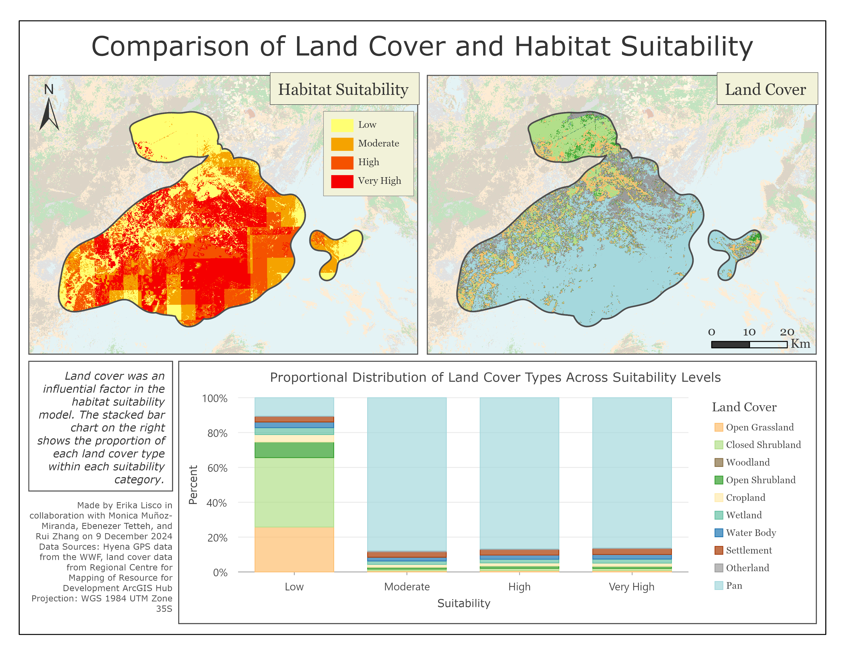
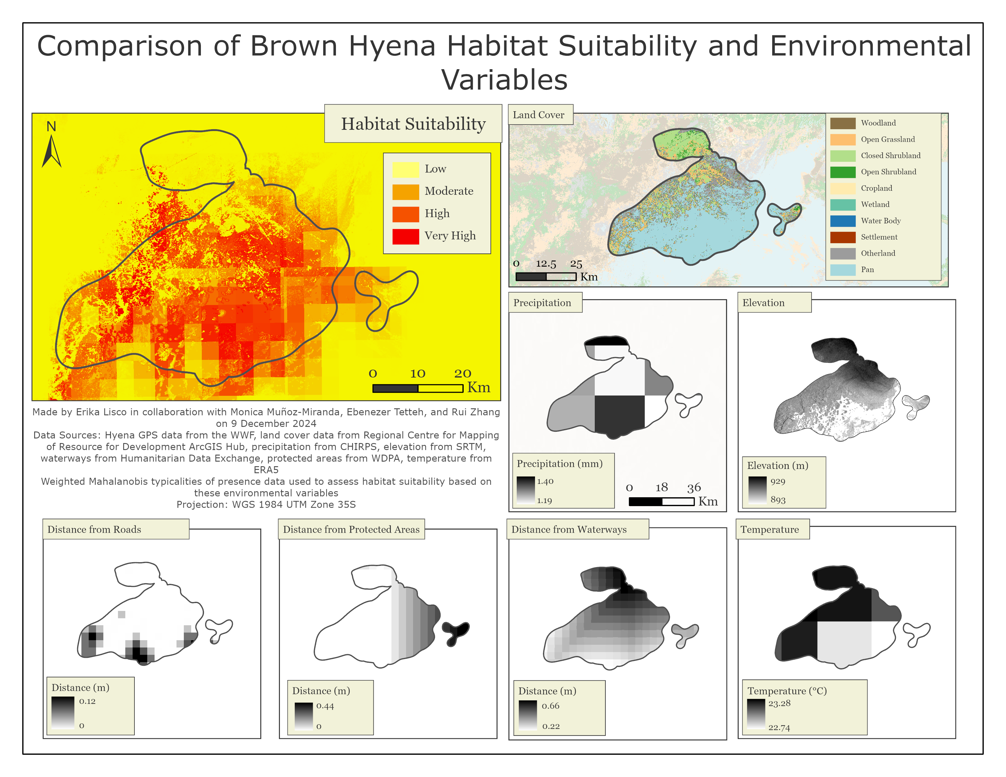
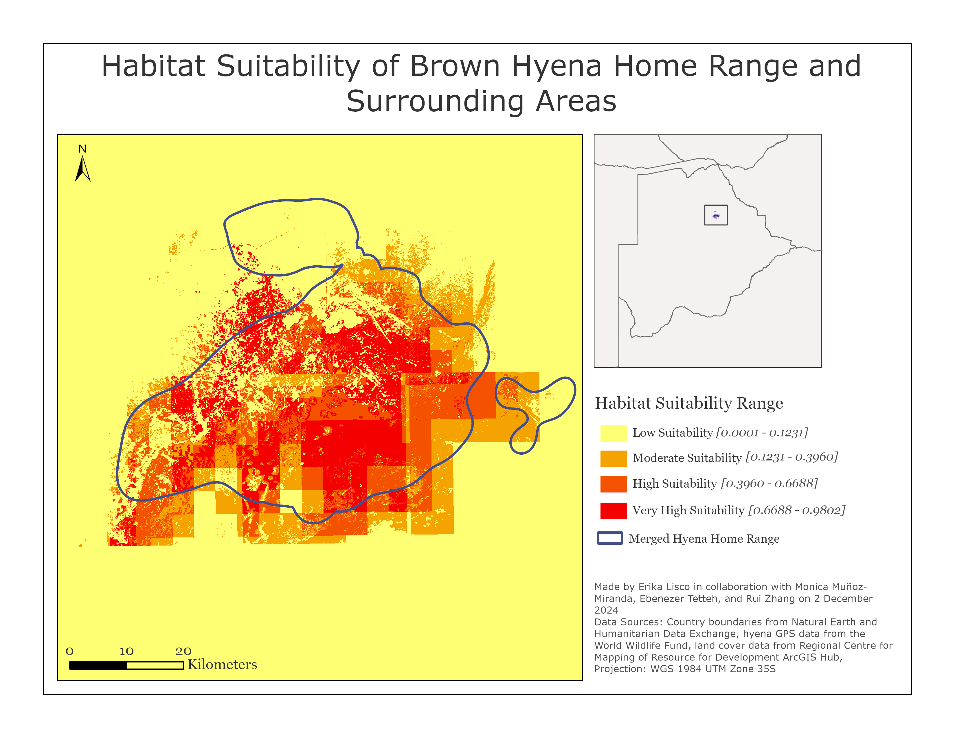
Modeling and Mapping the Habitat Preference and Movement Patterns of Brown Hyena in Botswana
This series of maps represents my final project for Advanced Raster GIS. Using GPS location data of brown hyenas in Botswana and environmental variables such as temperature, land cover, and precipitation, my group and I conducted a home range estimation and a habitat suitability analysis. The home range was modeled using the Continuous-Time Movement Modeling (ctmm) package in R, while the Habitat and Biodiversity Modeler in TerrSet was employed to develop the suitability model. These analyses provided insights into the spatial ecology and environmental preferences of brown hyenas within their home range.


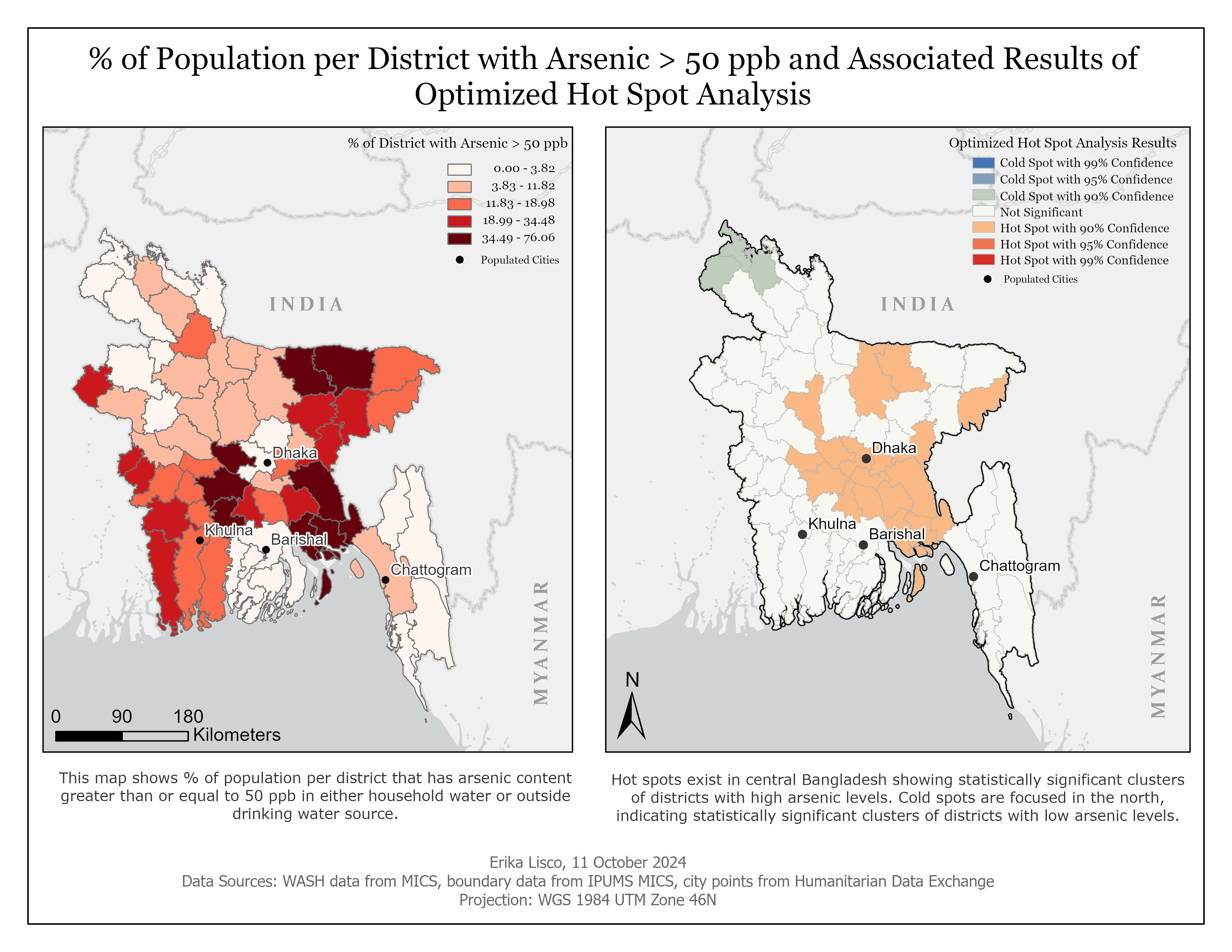
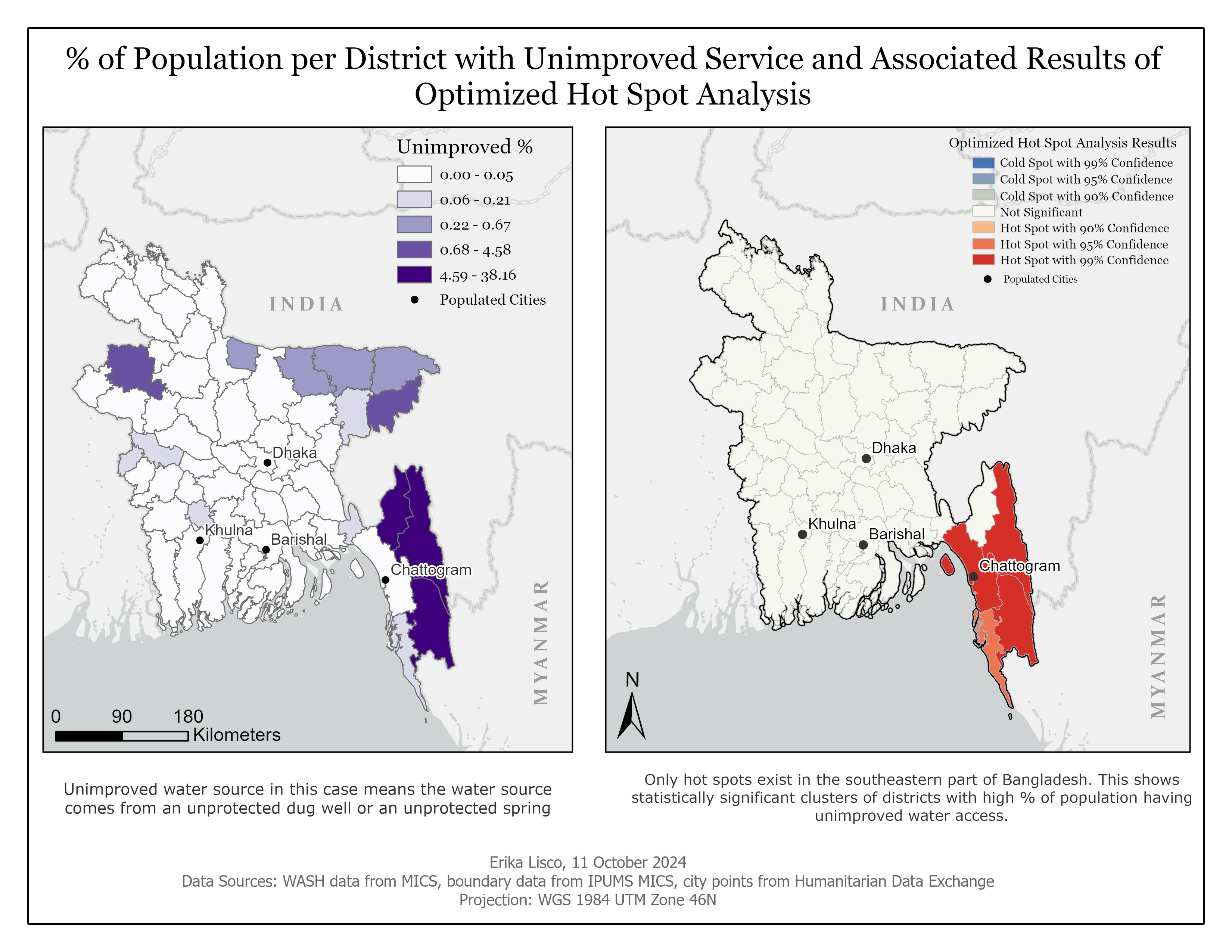
Analyzing Access to Drinking Water and Water Quality in Bangladesh
The goals of this study were to:
- Determine if there are districts in Bangladesh with reduced drinking water access that cluster together spatially
- Determine if there are districts in Bangladesh with higher arsenic concentrations that cluster together spatially
- Determine if there is any overlap between clusters of reduced drinking water access and high arsenic levels.
In this analysis, reduced water access was defined based on the Drinking Water Ladder framework developed by the Joint Monitoring Program (JMP), a collaboration between the World Health Organization (WHO) and United Nations Children’s Fund (UNICEF). Data from the UNICEF Multiple Indicator Cluster Survey were used to determine if a district had “Unimproved” and “No service” access to water based on the JMP standards. For Arsenic, 50 ppb was used as a benchmark to determine “good” water quality compared to “bad” water quality, as it is the national standard of Bangladesh.
For each dataset (districts with “unimproved” access, “no access”, or arsenic levels > 50ppb) an optimized hot spot analysis was done to determine if there are hot or cold spots related to these data. The following maps are the result of the analysis.

I created this map to compare temperature anomalies during the Paleocene-Eocene Thermal Maximum (PETM) to global temperature anomalies from 1850 to 2024.
The PETM is often considered the most similar warming event to the temperature increases currently observed in modern times. Present-day temperature trends are unfolding in a similar magnitude of warming to the PETM, but at a much faster rate, raising questions about the implications of this rapid warming on life on Earth.
Due to data and time constraints, the maps only show where warming occurred, not the warming trends in these areas. This limitation emphasizes the difficulty of using paleoclimate proxies to develop comprehensive spatial datasets on temperature at such large timescales.

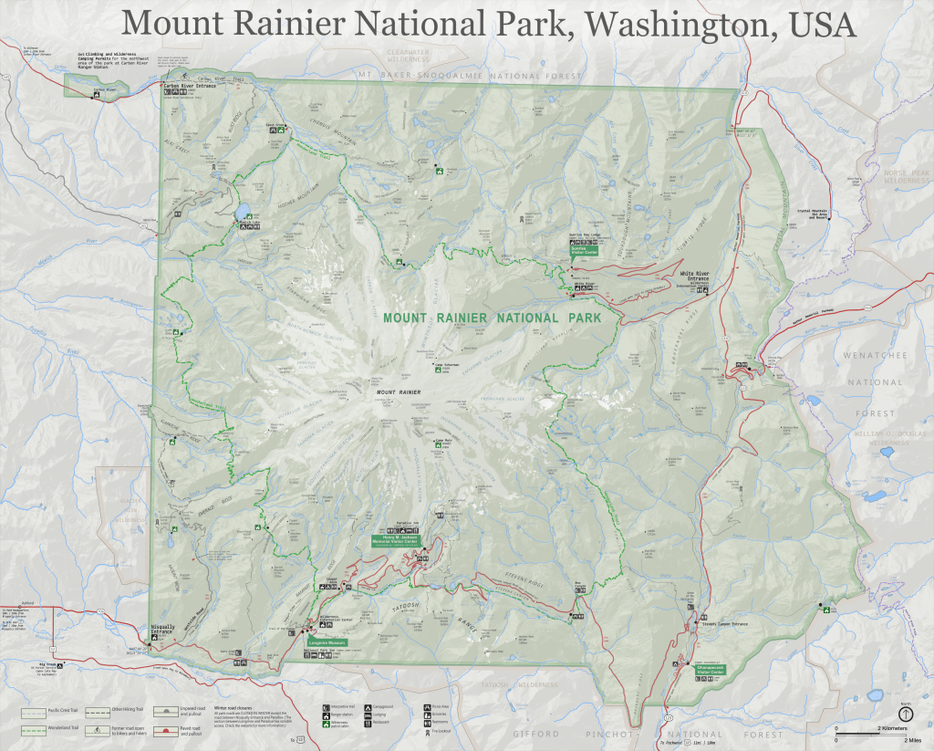
The premise of this project was to recreate the official National Park Service map for a park of our choice. I chose to recreate Mount Rainier National Park in Washington state. All elements on the map with the exception of labels were compiled in QGIS. The digital elevation model and hillshade were also created in QGIS. All labels and NPS icons were added to the map using Inkscape.
This assignment was to create a map of any county in New England. The requirements were to include at least a county boundary, major water bodies like lakes and rivers, major roads/highways/railways, land cover/land use, and points of interest such as hospitals and schools. I decided to focus my map on Providence County, Rhode Island.

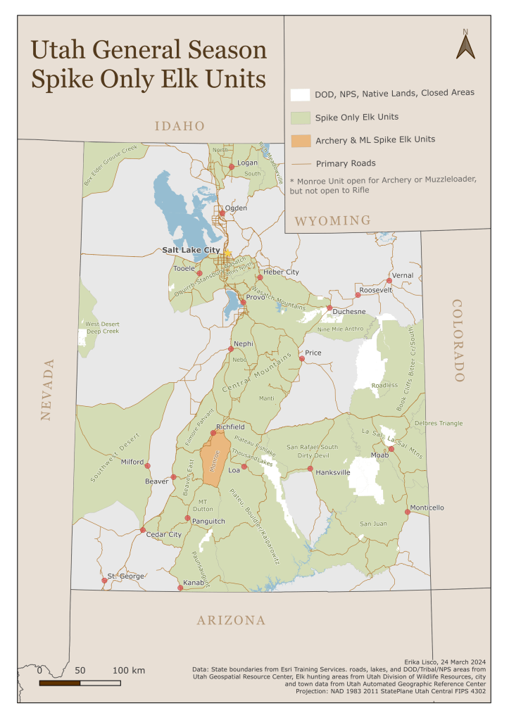
The following maps are intended to be improvements, based on my discretion, of the Utah Bull Elk hunting guidelines from the Utah Division of Wildlife Resources. These maps are based on the official maps that existed as of March 2024.


This assignment focused on mapping the central Massachusetts area compiling the major elements of cartography we learned to balance and weight labels properly, use aesthetically pleasing color schemes, and create a well-rounded map.
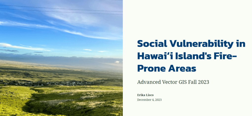
This is a link to a StoryMap I created for a final project in fall 2023 for a class called Advanced Vector GIS. It is an overview of the background, methodology, and results of creating a Social Vulnerability Index for fire prone areas of Hawaiʻi Island. All maps and analyses for this project were done using ArcGIS Pro. Static maps can be viewed at the bottom of the StoryMap. The final written report is available upon request.
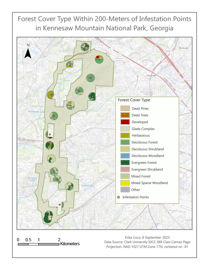
This map was created for an assignment in the Advanced Vector course as well. This assignment was to explore different tools such as buffer, erase, clip, intersect, dissolve, and merge to understand when to use which tool. This map demonstrates the use of the buffer tool with 200-meter buffers surrounding beetle-infested trees in Kennesaw Mountain National Park, Georgia. The clip tool was used to clip a forest cover layer to these buffers to generate the final output of forest cover types within 200-meters of infestation points.
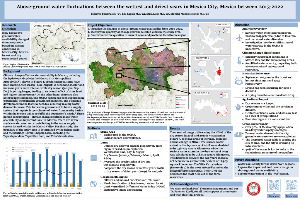
This poster was created for a final group project in fall 2023 for a class called Introduction to Remote Sensing. The goal of the project was to use a supervised classification to visualize above-ground water availability in Mexico City, Mexico, from 2013 to 2022. After the classification, we used the Normalized Difference Water Index to determine change in above-ground water availability during our study period.
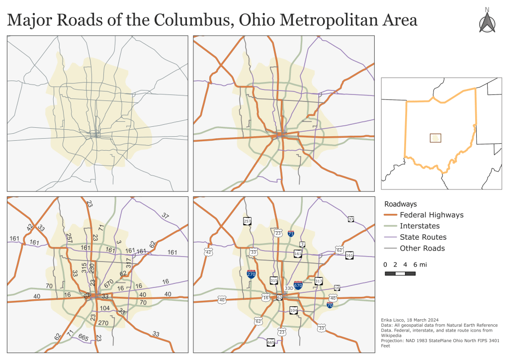
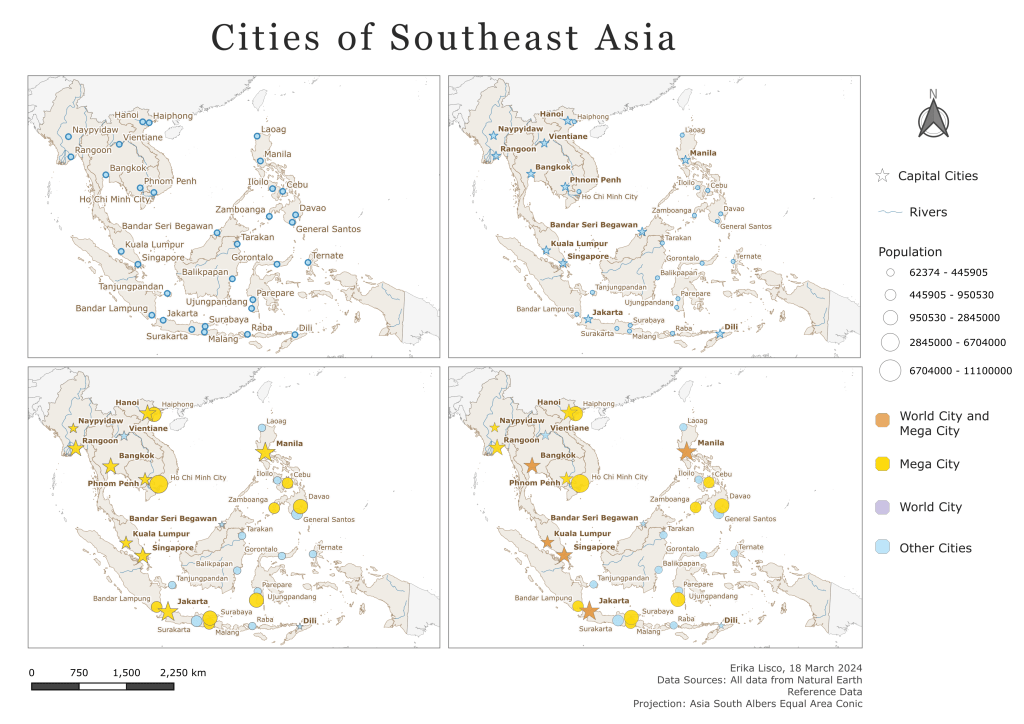
The following maps were created as an exercise on using labels: