For Fun
These are maps and other cartographic projects that I have made for fun. Enjoy!
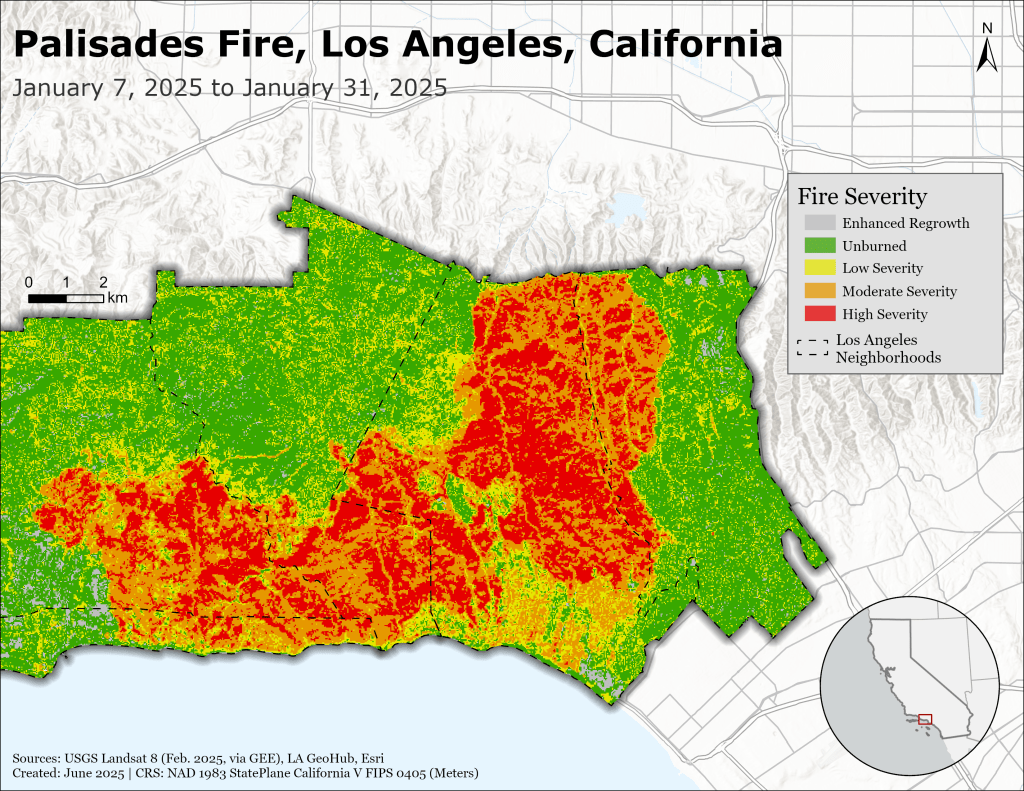
I determined the approximate burned area during the 2025 Palisades Fire in California using the differenced Normalized Burn Ratio of pre- and post-fire Landsat 8 imagery. The analysis was done using Google Earth Engine, and the map was created in ArcGIS Pro.
Link to GEE Script HERE
Using the GEE script from above, I extracted the moderate and high severity burn areas to create a burned area polygon.
I downloaded 2020 Los Angeles building footprint data and used that as an approximation of buildings standing before the fire.
To determine the number of buildings burned, I used the select by location tool using “Intersect”. This selected the number of buildings that intersected the burned area polygon.
This method assumes that all buildings in the burned area polygon were damaged. It also assumes that all building damage occurred only in “Moderate” and “High” severity fire areas.

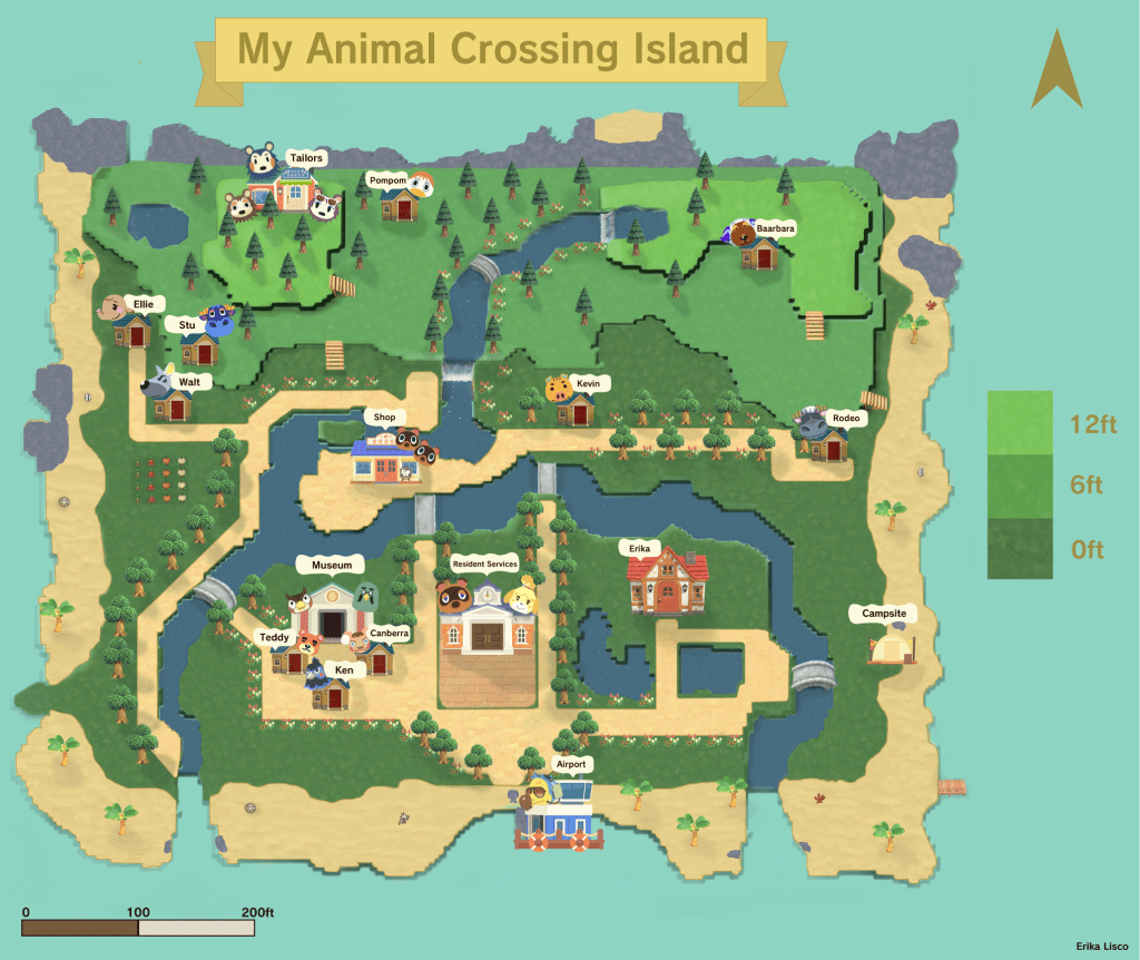
I recreated my map that exists in the popular game Animal Crossing New Horizons. Players choose to design their islands however they like and the map reflects these design choices. This recreation reflects how I chose to make my island in the game with relevant buildings, land features, and characters. I created the digital elevation model in QGIS and added all other elements in Adobe Photoshop and Illustrator.